CSS clip-path allows us to determine what part of an element should be shown. We can define a path and anything outside that path will be hidden. There are a number of different shape functions we can use, these are:
circleellipseinset - defines an inset rectanglepolygon - a set of x and y coordinates for a pathpath - an SVG path string
For this article, we'll be focusing on polygon.
The polygon shape function takes a set of x and y coordinates to make up a path, the x and y values being an offset from the top left of the element. Each of these sets of coordinates can be defined as any valid CSS length or as a percentage.
In all of the examples on this page, I'll be using images as they help visualise the things I'm talking about, but clip-path can be applied to any HTML element.
The example below shows how we can apply clip-path to an image using pixel values to show only a specified area.
HTML
<img
  src="/static/images/t5vV7unhLw-300.jpeg"
  width="300"
  height="200"
  alt="A clear gameboy and 3 games clipped into a triangle"
  loading="lazy"
  decoding="async"
  class="triangle-1"
/>
<img
  src="/static/images/t5vV7unhLw-300.jpeg"
  width="300"
  height="200"
  alt="A clear gameboy and 3 games clipped into a smaller triangle"
  loading="lazy"
  decoding="async"
  class="triangle-2"
/>
<p>
  Photo by
  <a
    href="https://unsplash.com/@dimhou"
    target="_blank"
    rel="external noopener noreferrer"
    >Dim Hou</a
  >
  on Unsplash
</p>
CSS
.triangle-1 {
  clip-path: polygon(150px 0px, 300px 200px, 0px 200px);
}

.triangle-2 {
  clip-path: polygon(75px 0px, 150px 100px, 0px 100px);
}
Result
This is fine if we know the size of our images and want to apply it to images with that particular size, otherwise we'll end up cropping out bits of larger or differently proportioned images. In the below example, the same image and clip-path are used, but one image is 300px and the other is 600px. As we can see, it shows the same size section of the image, but it shows different parts of the image.
HTML
<img
  src="/static/images/t5vV7unhLw-300.jpeg"
  width="300"
  height="200"
  alt="A clear gameboy and 3 games clipped into a triangle"
  loading="lazy"
  decoding="async"
  class="triangle"
/>
<img
  src="/static/images/t5vV7unhLw-600.jpeg"
  width="600"
  height="400"
  alt="A clear gameboy and 3 games clipped into a triangle"
  loading="lazy"
  decoding="async"
  class="triangle"
/>
<p>
  Photo by
  <a
    href="https://unsplash.com/@dimhou"
    target="_blank"
    rel="external noopener noreferrer"
    >Dim Hou</a
  >
  on Unsplash
</p>
CSS
.triangle {
  clip-path: polygon(150px 0px, 300px 200px, 0px 200px);
}
Result
If we want to allow the clip-path to flex and fit the image that we're applying it to, we can use percentages. This means that the clip path is based on a percentage of the image's dimensions, as can be seen below.
HTML
<img
  src="/static/images/jPB8yppx1f-300.jpeg"
  width="300"
  height="200"
  alt="A green gameboy color held in a hand and clipped into a triangle"
  loading="lazy"
  decoding="async"
  class="triangle"
/>
<img
  src="/static/images/LOMMHkSlRo-200.jpeg"
  width="200"
  height="298"
  alt="A classic gameboy on a black background clipped into a triangle"
  loading="lazy"
  decoding="async"
  class="triangle"
/>
<p>
  Photos by
  <a
    href="https://unsplash.com/@eli_j"
    target="_blank"
    rel="external noopener noreferrer"
    >Elias Castillo</a
  >
  and
  <a
    href="https://unsplash.com/@helloimnik"
    target="_blank"
    rel="external noopener noreferrer"
    >Hello I'm Nik</a
  >
  on Unsplash
</p>
CSS
.triangle {
  clip-path: polygon(50% 0%, 100% 100%, 0% 100%);
}
Result
We can also combine fixed units and percentages to achieve a balance between the look that we want and flexability.
HTML
<img
  src="/static/images/jPB8yppx1f-300.jpeg"
  width="300"
  height="200"
  alt="A green gameboy color held in a hand and clipped into an arrow"
  loading="lazy"
  decoding="async"
  class="clip"
/>
<img
  src="/static/images/LOMMHkSlRo-200.jpeg"
  width="200"
  height="298"
  alt="A classic gameboy on a black background clipped into an arrow"
  loading="lazy"
  decoding="async"
  class="clip"
/>
<p>
  Photos by
  <a
    href="https://unsplash.com/@eli_j"
    target="_blank"
    rel="external noopener noreferrer"
    >Elias Castillo</a
  >
  and
  <a
    href="https://unsplash.com/@helloimnik"
    target="_blank"
    rel="external noopener noreferrer"
    >Hello I'm Nik</a
  >
  on Unsplash
</p>
CSS
.clip {
  clip-path: polygon(0px 0px, 100% 50%, 0px 100%, 50px 50%);
}
Result
Finally, using the CSS calc function means that we can achieve offsets from each edge while still staying flexible to different shapes and sizes of image.
HTML
<img
  src="/static/images/t5vV7unhLw-300.jpeg"
  width="300"
  height="200"
  alt="A clear gameboy and 3 games clipped into a triangle"
  loading="lazy"
  decoding="async"
  class="clip"
/>
<img
  src="/static/images/t5vV7unhLw-600.jpeg"
  width="600"
  height="400"
  alt="A clear gameboy and 3 games clipped into a triangle"
  loading="lazy"
  decoding="async"
  class="clip"
/>
<p>
  Photo by
  <a
    href="https://unsplash.com/@dimhou"
    target="_blank"
    rel="external noopener noreferrer"
    >Dim Hou</a
  >
  on Unsplash
</p>
CSS
.clip {
  clip-path: polygon(
    0px 30px,
    30px 0px,
    calc(100% - 30px) 0px,
    100% 30px,
    100% calc(100% - 30px),
    calc(100% - 30px) 100%,
    30px 100%,
    0px calc(100% - 30px)
  );
}
Result
So now that we have all of the bits of knowledge that we have for the CSS side, lets look at the corner itself.
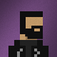
Below there is an example of a pixel art curve, with outlines added for emphasis. As you can see, it's made of a number of "blocks" (called pixels) and each of these is placed in a certain way to give the idea of a curve. We need to replicate this shape with our CSS clip-path.

To replicate the shape, we need to create a set of points that follow the outside of the pixels. If we start from the leftmost point that we need to define, we have x being 0px and y being 5px. We then need to step inwards one pixel to create the top of the pixel, so for our next point we have x being 1px and y still being 5px. Our next step is to follow the pixels up, so we have x still as 1px, but y is now 3px.
After repeating this to follow the entire curve, we get the following set of coordinates:
clip-path: polygon(
  0px 5px,
  1px 5px,
  1px 3px,
  2px 3px,
  2px 2px,
  3px 2px,
  3px 1px,
  4px 1px,
  5px 1px,
  5px 0px
);
This gives us the top left corner. By using calc() and flipping horizontally and vertically, we can create the points for the other 4 corners.
As you can see in the below demo, while it compares well to the border-radius example, it's not very noticable at the current scale because we're doing it on a single pixel basis.
HTML
<img
  src="/static/images/t5vV7unhLw-300.jpeg"
  width="300"
  height="200"
  alt="A clear gameboy and 3 games with pixelated rounded corners"
  loading="lazy"
  decoding="async"
  class="clip"
/>
<img
  src="/static/images/t5vV7unhLw-300.jpeg"
  width="300"
  height="200"
  alt="A clear gameboy and 3 games with rounded corners"
  loading="lazy"
  decoding="async"
  class="radius"
/>
<p>
  Photo by
  <a
    href="https://unsplash.com/@dimhou"
    target="_blank"
    rel="external noopener noreferrer"
    >Dim Hou</a
  >
  on Unsplash
</p>
CSS
.clip {
  clip-path: polygon(
    0px 5px,
    1px 5px,
    1px 3px,
    2px 3px,
    2px 2px,
    3px 2px,
    3px 1px,
    4px 1px,
    5px 1px,
    5px 0px,
    calc(100% - 5px) 0px,
    calc(100% - 5px) 1px,
    calc(100% - 3px) 1px,
    calc(100% - 3px) 2px,
    calc(100% - 2px) 2px,
    calc(100% - 2px) 3px,
    calc(100% - 1px) 3px,
    calc(100% - 1px) 4px,
    calc(100% - 1px) 5px,
    100% 5px,
    100% calc(100% - 5px),
    calc(100% - 1px) calc(100% - 5px),
    calc(100% - 1px) calc(100% - 3px),
    calc(100% - 2px) calc(100% - 3px),
    calc(100% - 2px) calc(100% - 2px),
    calc(100% - 3px) calc(100% - 2px),
    calc(100% - 3px) calc(100% - 1px),
    calc(100% - 4px) calc(100% - 1px),
    calc(100% - 5px) calc(100% - 1px),
    calc(100% - 5px) 100%,
    5px 100%,
    5px calc(100% - 1px),
    3px calc(100% - 1px),
    3px calc(100% - 2px),
    2px calc(100% - 2px),
    2px calc(100% - 3px),
    1px calc(100% - 3px),
    1px calc(100% - 4px),
    1px calc(100% - 5px),
    0px calc(100% - 5px)
  );
}

.radius {
  border-radius: 8px;
}
Result
To make it clearer, we have to scale the pixels up. I personally use a scaling multiplier of 4, so 4 on-screen pixels is one pixel in the design. To actually implement this, we take the fixed values from the previous example and multiply them by our scaling multiplier, so the top left corner would be the following:
clip-path: polygon(
  0px 20px,
  4px 20px,
  4px 12px,
  8px 12px,
  8px 8px,
  12px 8px,
  12px 4px,
  16px 4px,
  20px 4px,
  20px 0px
);
After applying this to the rest of the corners, it looks like the below demo:
HTML
<img
  src="/static/images/t5vV7unhLw-300.jpeg"
  width="300"
  height="200"
  alt="A clear gameboy and 3 games with pixelated rounded corners"
  loading="lazy"
  decoding="async"
  class="clip"
/>
<p>
  Photo by
  <a
    href="https://unsplash.com/@dimhou"
    target="_blank"
    rel="external noopener noreferrer"
    >Dim Hou</a
  >
  on Unsplash
</p>
CSS
.clip {
  clip-path: polygon(
    0px 20px,
    4px 20px,
    4px 12px,
    8px 12px,
    8px 8px,
    12px 8px,
    12px 4px,
    16px 4px,
    20px 4px,
    20px 0px,
    calc(100% - 20px) 0px,
    calc(100% - 20px) 4px,
    calc(100% - 12px) 4px,
    calc(100% - 12px) 8px,
    calc(100% - 8px) 8px,
    calc(100% - 8px) 12px,
    calc(100% - 4px) 12px,
    calc(100% - 4px) 16px,
    calc(100% - 4px) 20px,
    100% 20px,
    100% calc(100% - 20px),
    calc(100% - 4px) calc(100% - 20px),
    calc(100% - 4px) calc(100% - 12px),
    calc(100% - 8px) calc(100% - 12px),
    calc(100% - 8px) calc(100% - 8px),
    calc(100% - 12px) calc(100% - 8px),
    calc(100% - 12px) calc(100% - 4px),
    calc(100% - 16px) calc(100% - 4px),
    calc(100% - 20px) calc(100% - 4px),
    calc(100% - 20px) 100%,
    20px 100%,
    20px calc(100% - 4px),
    12px calc(100% - 4px),
    12px calc(100% - 8px),
    8px calc(100% - 8px),
    8px calc(100% - 12px),
    4px calc(100% - 12px),
    4px calc(100% - 16px),
    4px calc(100% - 20px),
    0px calc(100% - 20px)
  );
}
Result
We have some nice pixelated rounded corners! I think it looks great and fits in really well on my site. This technique can be used for all sorts of shapes though, and it doesn't have to be pixelated.
But if you do want to do pixelated rounded corners, you can save yourself the effort and use the generator that I created after I'd done this on my own site. With the generator you can choose your own pixel multiplier and radius rather than using the ones I've defined here, and you'll get a live preview!
